
A QR code that scans from a designer’s monitor is not necessarily a reliable QR code.
The real test is whether it still scans after it has been printed small, viewed at an angle, placed under uneven light, compressed into a social image, or aimed at with an older phone. That difference—between scannable once and dependably scannable in the real world—is what QR code reliability measures.
Most QR code design mistakes come from treating the symbol like an ordinary graphic. It is not. A QR code is a measured grid with fixed landmarks, a required clear border, encoded data, and error-correction information. Rounded dots, gradients, logos, shadows, frames, and textures all change the signal a scanner must recover.
This guide explains the three ideas that matter most: the QR code quiet zone, QR code error correction, and the cumulative damage caused by styling. It also shows how to test those risks before you commit a code to a menu, sign, package, label, or business card.
What makes a QR code reliable?
A camera does more than recognize black and white squares. It must:
- Separate the QR code from its surroundings.
- Find the three large corner targets.
- Determine the grid’s position, orientation, and module size.
- Decide whether each module is dark or light.
- Reconstruct any damaged data using error correction.
A failure at an early step can prevent every later step. That is why a code with high error correction can still fail instantly: error correction cannot help if the scanner never locates the symbol or cannot resolve its grid.
Reliable QR codes give the camera generous margins at every step. They have a clean quiet zone, strong contrast, modules large enough to resolve, recognizable finder patterns, limited obstruction, and a design that survives the expected viewing angle and material.
The QR code quiet zone is not optional whitespace
The quiet zone is the blank border around all four sides of a QR code. For a standard QR Code, it should be at least four modules wide. A module is one square in the QR grid, so the physical width of the quiet zone scales with the code.
If one module prints at 0.5 mm, the minimum quiet zone is 2 mm on every side. If one module is 1 mm, the quiet zone is 4 mm. The requirement is based on modules, not on an arbitrary number of pixels.
The quiet zone gives a scanner a clean transition from the surrounding scene to the symbol. Without it, nearby text, a border, a photo, or another dark shape can appear to be part of the code. Detection becomes slower or fails entirely.
Common quiet-zone violations include:
- Cropping the exported image tightly against the outer modules
- Placing a decorative border inside the clear margin
- Letting a background photo show through a transparent QR background
- Extending a gradient, texture, glow, or shadow into the margin
- Putting a caption or call-to-action too close to the code
- Allowing a print shop’s trim or bleed to cut into the required space
White is the safest quiet-zone color, but the underlying principle is separation. A uniform light background can work when it maintains strong contrast with the dark modules. Busy artwork, transparency, and visual effects make that separation uncertain.
The MonkeyTactics QR Code Generator includes a Quiet zone overlay that marks the full four-module margin. It turns a vague instruction like “leave some space” into a boundary you can inspect.
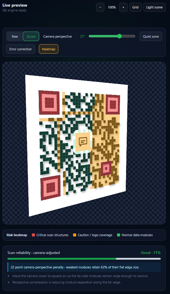
At a simulated 37-degree camera angle, the heatmap reveals compressed modules and the reliability score falls to 71 percent.
QR code ECC levels: L, M, Q, and H
QR codes use Reed–Solomon error correction to add redundant information. If part of the symbol is dirty, scratched, blurred, or covered, a scanner may use that redundancy to reconstruct the missing data.
There are four QR code ECC levels:
| ECC level | Approximate recovery | Typical use |
|---|---|---|
| L (Low) | About 7% | Clean, controlled environments where maximum capacity matters |
| M (Medium) | About 15% | General-purpose codes with little or no obstruction |
| Q (Quartile) | About 25% | More demanding print conditions or modest logo use |
| H (High) | About 30% | Designs with greater expected damage or carefully limited center logos |
These percentages are useful shorthand, not a promise that you may cover that percentage of the visible square. Error correction operates on encoded codewords, and the location and shape of the damage matter. A logo can erase important information unevenly. Damage to finder, timing, alignment, version, or format patterns can be more disruptive than the same area lost elsewhere.
Higher ECC also has a cost. More of the symbol is reserved for recovery data, leaving less capacity for the original message. The generator may need a higher QR version—a denser grid with more modules—to hold the same content. If the printed size stays fixed, each module becomes smaller and harder for a camera to resolve.
That creates a tradeoff many QR styling guides miss:
Increasing error correction can improve damage tolerance, but the denser symbol it creates may reduce distance and small-print reliability.
Use the lowest level that safely matches the real risk, then keep the design clean. Do not select H as permission to cover the code aggressively.
What error correction can—and cannot—fix
Error correction is good at recovering a limited amount of unreadable encoded data. It can help with:
- A small scratch or stain
- Minor print defects
- Limited logo coverage in a protected area
- A few modules lost to glare or blur
- Some localized physical wear
It cannot reliably compensate for:
- A missing or contaminated quiet zone
- Finder patterns redesigned beyond recognition
- Modules that are too small for the camera
- Dark and light colors with insufficient contrast
- Severe perspective compression
- Motion blur across the entire symbol
- A logo that removes more data than the ECC budget can recover
- Widespread texture, transparency, or reflections that make module values ambiguous
Think of ECC as a reserve, not a design budget. Real-world printing and scanning already consume some of that reserve before a logo or artistic effect is added.
Why styled QR codes fail
Styled QR codes rarely fail because of one dramatic mistake. More often, several small choices stack together.
A dark green code on cream may scan. Rounded modules may scan. A small logo may scan. A gradient may scan. But combine rounded modules, a low-contrast gradient, a large logo, a transparent background, a glow, and small printing, and the scanner loses multiple kinds of information at once.
1. Low contrast makes modules ambiguous
The scanner must classify every sampled module as dark or light. Pale foregrounds, dark backgrounds, and gradients that pass through similar tones reduce that separation.
Black on white remains the most forgiving combination. Color can work, but keep the modules substantially darker than the background across the entire code. Test the lightest part of a foreground gradient against the darkest part of the background, not just two convenient color swatches.
2. Decorative modules reduce the readable area
Dots, diamonds, stars, and heavily rounded shapes leave more empty space inside each nominal module. At a large size, a camera may still separate them. At a small size or steep angle, the gaps blur and neighboring modules merge.
Styling also should not make ordinary data modules resemble the large finder patterns. Those corner targets need to remain visually dominant and geometrically clear.
3. Logos remove data; they do not sit “on top” harmlessly
A center logo covers modules. A white plate behind the logo often improves visual separation, but it also covers additional modules. ECC may recover that missing information only while the obstruction remains within the actual recovery capacity.
Keep logos centered, modest, high-contrast, and away from function patterns. Increase ECC deliberately, use a safety limit, and scan the final exported artwork—not only the preview.
4. Effects contaminate edges and the quiet zone
Shadows, glow, noise, texture, transparency, and artistic masking can create marks where the scanner expects clean space. They can also soften module edges or make the same code behave differently on each background.
A design that works over a white editor canvas may fail when exported transparently and placed over a photograph.
5. Long content creates dense QR codes
More data means more modules. Tracking parameters, verbose text, large contact records, and long Wi-Fi credentials can force a higher QR version. At the same output size, the individual modules shrink.
Shorten the payload when possible. For a website, use a concise, stable HTTPS URL on a domain you control. Avoid piling unnecessary campaign parameters into a code intended for small print.
6. Perspective turns squares into compressed shapes
A phone often sees a poster, tabletop card, product label, or screen from the side. Under perspective distortion, modules along the far edge become narrower and cover fewer camera pixels. Blur and glare then have less information to destroy before those modules disappear.
Alignment patterns help a decoder correct geometry, but they cannot restore detail the camera never captured. A QR code designed only for a straight-on desktop preview is unfinished.
Why “it scanned on my phone” is a weak test
One successful scan proves only that one camera, decoder, distance, angle, screen, and lighting setup worked once.
A useful QR test varies the conditions that will exist after publication:
- Test at the final physical size, not a zoomed preview.
- Try multiple phone models and both iOS and Android when possible.
- Scan from closer and farther away.
- Tilt the code horizontally and vertically.
- Test bright, dim, and uneven lighting.
- Print on the actual stock or material.
- Test through laminate, glass, or a glossy finish if the final code will use one.
- Scan the exported PNG, SVG, or PDF and a sample from the real printer.
- Test after the image has passed through any social platform, document editor, or messaging app that may resize or compress it.
For a public sign or packaging run, test several samples. Printer registration, ink spread, trim, curvature, and surface reflections can vary across production.
A practical QR reliability workflow
The MonkeyTactics generator is designed to make those failure modes visible while you work.
Start with a conservative baseline
Enter the shortest practical payload. Begin with dark modules, a light solid background, square or gently rounded shapes, no logo, and an intact four-module quiet zone. Confirm that the baseline score is strong before styling.
Add one design choice at a time
Change the color, module style, finder eyes, logo, frame, or effect separately. Watch the Scan reliability score and the accompanying suggestions after each change. If several changes lower the score, remove the least important visual effect first.
The score evaluates design risks such as contrast, module size, quiet-zone integrity, effects, and logo coverage. It is a preflight check, not a guarantee; physical testing still matters.
Inspect the structure
Use the preview controls to switch between the raw and styled code:
- Raw shows the underlying black-and-white symbol.
- Styled shows the finished design.
- Quiet zone marks the required clear border and flags contamination.
- Error correction distinguishes function, data, and recovery regions.
- Heatmap highlights modules that are most vulnerable to the current design and simulated view.
The ECC overlay is especially useful for correcting a common misconception: error-correction modules are not a disposable square directly beneath the logo. Function, data, and recovery responsibilities are distributed through the symbol.
Simulate an imperfect camera angle
Move the Camera perspective control away from 0°. The preview compresses the grid and recalculates a camera-adjusted reliability score. The heatmap reveals which far-side modules are moving from low risk to caution or critical risk.
This simulation does not replace testing with a real camera, but it exposes fragile designs before printing. If a small angle causes a large score drop, the code has little real-world margin.
Export for the destination
Use SVG or a print-resolution export when the code will be printed. Avoid enlarging a small raster image after download. Preserve the quiet zone when placing the file in a layout, and do not let a designer or print workflow crop it away.
Then test the exported file at its final size and in its final context.
QR code reliability checklist
Before publishing or ordering a print run, confirm all of the following:
- The quiet zone is at least four modules wide on every side.
- Nothing—text, border, texture, shadow, or artwork—enters that margin.
- Dark and light areas have strong contrast throughout the design.
- Finder patterns remain clear and recognizable.
- Modules are large enough at the final output size.
- The payload is as short as practical.
- The ECC level matches the expected damage and logo use.
- Any logo is centered, limited, and kept away from function patterns.
- The design still scores well under perspective simulation.
- The final export has been tested on multiple devices.
- A physical sample has been tested under realistic lighting and distance.
Frequently asked questions about QR code scanning problems
How much quiet zone does a QR code need?
A standard QR Code needs a clear margin at least four modules wide on all four sides. Measure it relative to the module size, not with a fixed pixel value.
Which QR code error correction level is best?
There is no universal best level. M is a sensible general baseline, while Q or H may be appropriate for controlled logo use or harsher conditions. Higher ECC increases redundancy but can also make the code denser, so it should not be selected automatically.
Does high error correction guarantee a QR code will scan?
No. ECC can reconstruct some damaged encoded data. It cannot guarantee detection when the quiet zone is missing, contrast is poor, function patterns are damaged, modules are too small, or the camera view is severely distorted.
Why does my QR code scan on screen but not in print?
The printed modules may be too small, ink may spread, the quiet zone may have been cropped, the material may reflect light, or the printer may have reduced contrast. Test the final exported artwork at actual size on the intended material.
Can I put a logo in a QR code?
Yes, if the logo is modest, centered, kept clear of function patterns, paired with an appropriate ECC level, and tested carefully. A logo always removes usable modules, so it should be treated as controlled damage.
Are rounded or colorful QR codes reliable?
They can be, but reliability depends on the whole design. Strong contrast, sufficient module size, clear finder patterns, an intact quiet zone, and restrained styling matter more than any single shape or color choice.
Design for the worst reasonable scan
The goal is not to create a QR code that a flagship phone can decode under perfect conditions. The goal is to create one that ordinary people can scan quickly without finding the correct angle, moving closer, or opening a different camera app.
That means preserving the quiet zone, treating ECC as a safety reserve, and evaluating styling as cumulative signal loss. A reliable design can still look distinctive—it simply makes recognition the first constraint.
Build and test your QR code with MonkeyTactics. The generator runs locally in your browser and combines advanced styling with a live reliability score, quiet-zone and ECC visualization, a risk heatmap, and camera-perspective simulation before you export.
QR Code is a registered trademark of DENSO WAVE INCORPORATED.