
A QR code does not have to look like a black-and-white shipping label. It can use brand colors, a gradient, rounded modules, custom finder eyes, a center logo, a call-to-action frame, and restrained visual effects.
The hard part is knowing which changes are cosmetic and which changes remove information a scanner needs.
Good QR code design works in layers. Start with a strong, ordinary code. Add one visual choice at a time. Preserve the quiet zone and finder patterns. Keep enough contrast. Treat a logo as intentional damage. Then test the finished artwork at the size, distance, angle, and material people will actually encounter.
This guide shows how to create a beautiful custom QR code without turning it into a frustrating puzzle for phone cameras.
The first rule: recognition comes before decoration
A QR code is a machine-readable grid before it is a graphic. A scanner must find the symbol, determine its orientation, map its modules, and separate dark cells from light cells before error correction can recover damaged data.
Every styling decision should protect that sequence.
The most important visual components are:
- The quiet zone: the clear margin surrounding the code
- Finder patterns: the three large corner targets, often called eyes
- Timing and alignment patterns: structures that help the scanner map the grid
- Data modules: the cells carrying the encoded message
- Error-correction data: redundancy used to recover some unreadable information
You can customize around these structures, but you should not make them ambiguous. A design that looks beautiful in a large preview can still fail after it is reduced, compressed, printed, tilted, or placed over a textured background.
If you want the technical foundation first, read QR Code Reliability: Quiet Zones, ECC Levels, and Why Most Styled QRs Fail.
What a safely styled QR code can look like
The example below combines a foreground gradient, rounded modules, custom finder eyes, a protected center logo, a gradient frame, a short “SCAN ME” label, and a drop shadow. The live reliability analysis still rates it Excellent at 90%.
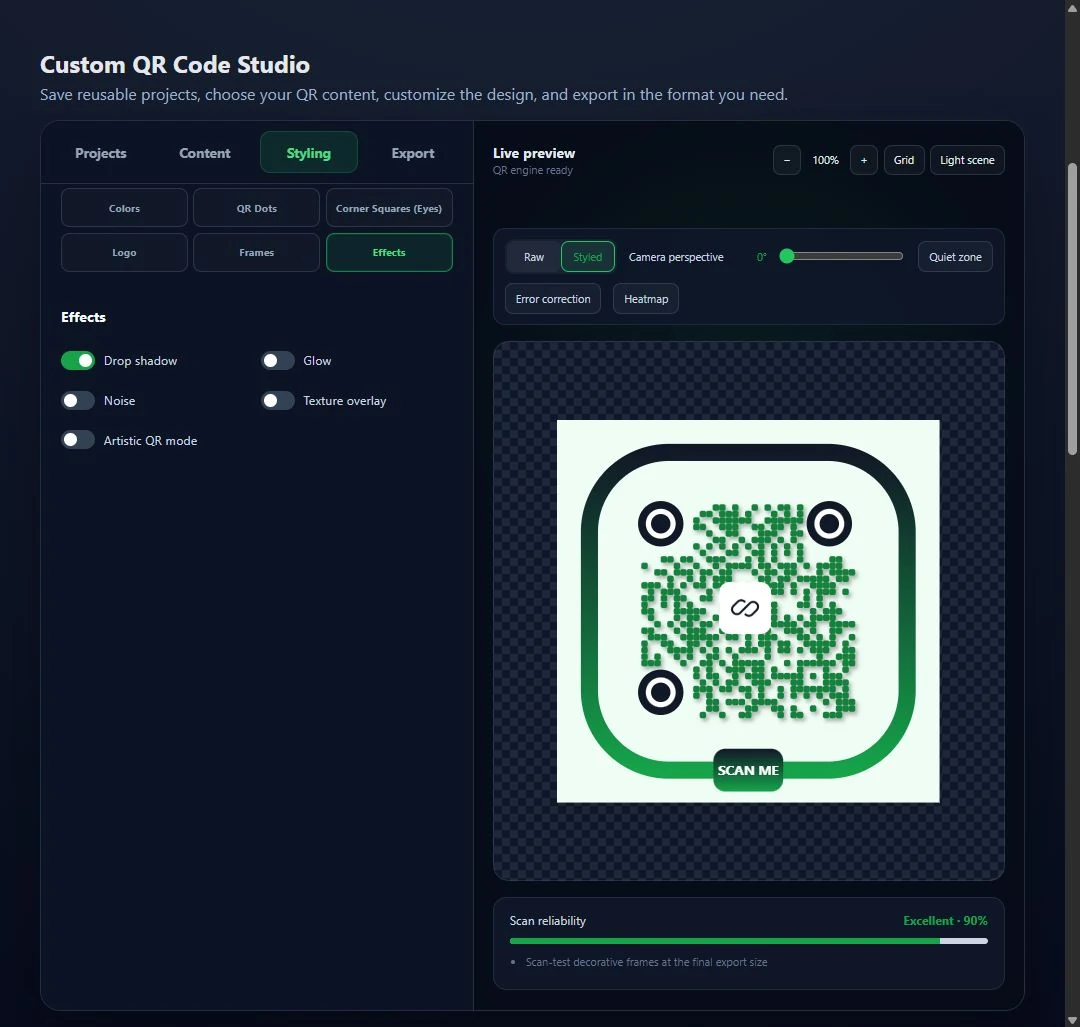
A styled QR code can remain highly scannable when each decorative layer preserves contrast, structure, logo safety, and the quiet zone.
That score is not a guarantee that every print will scan. It is a preflight signal that the design still has a healthy margin before real-world testing.
QR code color rules that protect scanability
Color is usually the safest place to begin because it can change the personality of a code without changing its geometry. The catch is that a scanner cares more about luminance contrast than your brand palette.
Keep the modules darker than the background
The traditional arrangement—dark modules on a light background—is the most widely reliable. A dark navy, forest green, burgundy, or deep purple can work almost as well as black when placed on white or another very light solid background.
Reversed QR codes with light modules on a dark background sometimes scan, but they give you less compatibility across camera apps and conditions. Use the conventional polarity when reliability matters.
Judge the entire color combination
Do not evaluate only the two colors shown in a brand guide. Consider what happens after the code is:
- Printed by an office printer
- Displayed on a dim or low-quality screen
- Photographed under warm or colored light
- Compressed into a JPEG
- Placed behind reflective laminate or glass
- Viewed by a camera that adjusts exposure automatically
Small differences between neighboring tones disappear quickly. Pale gray on white, yellow on cream, blue on dark purple, or red on black may look distinct to a person while producing a weak camera signal.
Avoid transparency over uncontrolled backgrounds
A transparent QR background is predictable only while the artwork beneath it is predictable. Place the same transparent file over a photo and formerly light cells can become dark, the quiet zone can disappear, and the scanner may misclassify modules.
If the code will be reused across layouts, give it a solid background and preserve its clear margin inside the exported asset.
Contrast analysis is a starting point, not a print test
The MonkeyTactics QR Code Generator checks the visual contrast of the current design and includes contrast in its reliability score. Use that feedback to reject weak combinations early, then scan a physical sample in realistic lighting.
How to use QR code gradients safely
QR code gradients are attractive because they add depth without requiring a complex logo or background. They are also easy to misuse.
Keep every foreground stop dark enough
A gradient is only as reliable as its weakest section. A transition from black to deep green may be safe. A transition from deep green to pale lime can make the pale side disappear against white.
Check the lightest foreground stop against the darkest part of the background. Do not rely on the average appearance of the gradient.
Prefer gradients within the modules
Keep the background and quiet zone simple. Applying a gradient to the dark module area is generally safer than pushing color variation into the light cells or the required clear border.
The MonkeyTactics studio supports linear, radial, conic, module-based, and logo-aware gradient modes. More elaborate geometry does not automatically mean more risk; the actual risk comes from weak local contrast and visual contamination.
Protect the finder eyes
Finder patterns should remain the clearest shapes in the design. If the main gradient becomes lighter near a corner, give the eyes their own consistently dark colors. This creates an intentional visual anchor for both the scanner and the design.
Watch gradients after export
Printed gradients can band, shift color, or reproduce lighter than the preview. SVG and print-resolution formats preserve smooth transitions better than enlarging a small PNG, but the printer, ink, and stock still determine the final result.
Module patterns: where style can become signal loss
The small cells in a QR code are commonly called modules or QR dots. Changing their shape creates an immediate visual identity, but the camera still needs to recognize their occupied area.
Safer module shapes
Square, softly rounded, circle, squircle, capsule, hexagon, diamond, and other shapes can work when modules remain large and well separated. Conservative rounding often provides the best balance between personality and recognition.
The MonkeyTactics studio also includes pattern presets such as Classic grid, Soft dots, Tech matrix, and Artistic mask. Treat heavily artistic options as advanced settings that demand more testing.
Do not shrink modules too aggressively
Reducing module size creates more visible space between cells. That can look clean on a large monitor, but it reduces the number of dark pixels the camera receives. Perspective, blur, distance, and print spread can then erase or merge modules.
If the code will be small, scanned from several feet away, or printed on an uneven surface, keep modules close to their full cell size.
Remember that payload length changes the grid
Long URLs and large data records produce denser QR codes. At a fixed printed size, a denser grid means smaller individual modules. A module style that works for a short URL may fail when applied to a long tracking link.
Finalize the encoded content before approving the design.
Custom finder-eye styles: distinctive but unmistakable
The three large corner markers are the strongest visual landmarks in the symbol. Custom eye styles can make a QR code feel branded before a logo is added, but the patterns must still stand apart from ordinary data modules.
The studio offers square, rounded, circle, leaf, hexagon, diamond, capsule, teardrop, heart, honeycomb, concentric, and other eye shapes, along with Classic, Duo, and Orbit presets.
Use these rules:
- Keep all three eyes clearly visible.
- Maintain strong contrast between the outer and inner eye components.
- Avoid surrounding artwork that looks like a fourth finder pattern.
- Do not let a frame, logo, texture, or crop overlap an eye.
- Test non-square eyes at the smallest intended output size.
Custom eyes should look like a deliberate variation of the corner targets, not unrelated illustrations.
How to add a QR code with a logo safely
A QR code with a logo is one of the most common branding requests—and one of the easiest ways to damage a code.
The logo does not float harmlessly above the data. It covers modules. A backdrop or safety border around it covers even more. Error correction may reconstruct the missing data only while the obstruction stays within the available recovery capacity.
Keep the logo centered and modest
The center is usually the safest area because the three finder patterns live in the corners, but the center still contains encoded information and may contain an alignment pattern. Do not use a fixed “logo can cover X percent” rule without considering the QR version, ECC level, and obstruction shape.
Start small. Increase the logo only while the reliability analysis and real scan tests remain strong.
Use a clean logo backdrop
A solid white or high-contrast plate separates the logo from the QR modules. Rounded squares, squircles, and circles can all work. The backdrop should be slightly larger than the logo, but not so large that it erases unnecessary data.
Preserve a safety border
The MonkeyTactics safe-logo system can add a white safety border, clear an extra module around the logo, and automatically choose a contrasting backdrop. These features reduce visual interference at the logo edge.
Protect the ECC reserve
Safe mode limits risky logo placement and coverage, while automatic error-correction adjustment raises the ECC level when appropriate. In the current studio, logo and frame workflows can boost error correction to Q.
That protection is valuable, but it does not make an oversized logo safe. Higher ECC can make the grid denser, and real printing defects also consume part of the recovery reserve.
Use simple logo artwork
A compact symbol usually works better than a detailed wordmark. Fine lines, tiny letters, transparent edges, and subtle gradients can disappear at QR-code scale even when the code itself remains scannable.
Frames should sit outside the quiet zone
A frame can turn an unexplained square into a clear instruction. “SCAN ME,” “OPEN,” “MENU,” “WIFI,” “PAY,” and “JOIN” tell people what to do and can improve engagement.
The frame must not invade the quiet zone.
MonkeyTactics centers frames outside the protected margin and provides controls for QR separation, border thickness, corner radius, label size, color, gradient, pattern, and icon-based styles. Because the required whitespace is retained between the code and frame, the call to action does not become part of the symbol.
For a safe frame:
- Keep the label short and legible.
- Maintain clear space between the modules and border.
- Avoid shapes that point into or overlap the code.
- Ensure the frame contrasts with the page without confusing the finder eyes.
- Scan-test the complete framed export, not only the inner QR.
Frames increase the overall artwork size. When placing one in a layout, size the QR grid for the required scan distance first, then allow additional room for the frame.
Shadows, glow, texture, and artistic effects
Effects can make a digital QR code feel integrated with a design, but they should be the last layer added.
Drop shadow
A restrained shadow outside the code can provide depth without changing the modules. Keep it soft, offset from the grid, and away from the quiet zone’s inner boundary. Dense or sharply defined shadows may be mistaken for additional dark structure.
Glow
Glow can work on screens when it remains outside the code and contrast stays strong. A glow that spreads through the quiet zone or softens module edges is risky. It can also reproduce unpredictably in print.
Noise and texture
Noise places extra light and dark marks into the image. Texture changes local contrast. Both compete directly with the module grid and should be used sparingly, especially for small codes.
Artistic masking
Artistic QR modes make the most aggressive changes and need the widest reliability margin. Use them for large, controlled placements—not for a tiny label, payment code, ticket, or safety-critical instruction.
A safe custom QR code styling workflow
The order in which you design matters. This sequence makes it easy to identify which choice caused a reliability problem.
1. Finalize the content
Choose the QR type and enter the final URL, Wi-Fi credentials, contact information, event, or other payload. Shorten unnecessary data before styling.
2. Confirm the raw code
Use the Raw preview to inspect the underlying black-and-white symbol. Make sure the starting reliability score is excellent and the quiet zone is intact.
3. Choose a safe color system
Set a light solid background and dark foreground. Add a conservative gradient only after the basic colors pass contrast analysis.
4. Customize modules and eyes
Choose module and finder-eye shapes that suit the brand. Keep module size generous and the eyes visually dominant.
5. Add the logo through safe mode
Use a centered logo, automatic contrast, a safety border, protected ECC, and automatic error-correction adjustment. Reduce logo size if the score falls sharply.
6. Add the frame outside the quiet zone
Select a short call to action and leave ample QR separation. The frame should explain the code without touching it.
7. Add one optional effect
Try a shadow or mild glow, then compare the new score with the previous design. Avoid stacking every effect merely because the controls exist.
8. Use the diagnostic views
Turn on the quiet-zone overlay, ECC visualization, and heatmap. Move the Camera perspective slider to see whether far-side modules become vulnerable at an angle.
9. Export and test the real artifact
Use SVG or a print-resolution export for physical material. Test the final file at actual size on multiple phones, then test a sample from the intended printer and stock.
Safe QR code design checklist
Before publishing a custom code, confirm that:
- The background is solid, light, and predictable.
- Every foreground or gradient color remains clearly darker than the background.
- The four-module quiet zone is clean on all sides.
- Module shapes remain large and distinct at final size.
- Finder eyes are obvious and unobstructed.
- The logo is centered, modest, and backed by a clean safety area.
- Safe mode and automatic ECC adjustment are enabled for logo use.
- The frame remains outside the quiet zone.
- Shadows and glow do not contaminate module edges or clear space.
- The reliability score remains strong under perspective simulation.
- The exported file scans on multiple devices.
- A physical sample works at the expected distance and lighting.
Frequently asked questions about custom QR code styling
Can QR codes be any color?
QR codes can use many colors, but dark modules on a light background are the safest. The important rule is strong luminance contrast across the entire symbol. Avoid pale foregrounds, transparent backgrounds, and reversed polarity when broad scanner compatibility matters.
Can a QR code have a gradient?
Yes. Keep every foreground gradient stop dark enough against the background, preserve consistently dark finder eyes, and do not apply a busy gradient inside the quiet zone. Test the exported gradient after printing or compression.
How big can a logo be in a QR code?
There is no universal safe percentage. The answer depends on the QR version, ECC level, logo shape, safety border, payload density, and final size. Begin with a small centered logo, use protected settings, and increase it only while reliability and real scan tests remain strong.
Do rounded QR codes still scan?
Rounded modules and eyes can scan reliably when they retain enough occupied area, remain well separated, and are reproduced at a sufficient size. Extreme rounding combined with small modules, weak contrast, or perspective distortion is much less forgiving.
Does a frame make a QR code harder to scan?
A frame is safe when it stays outside the complete four-module quiet zone. A border that touches the outer QR modules or fills the clear margin can interfere with detection.
Are shadows and glow safe for QR codes?
They can be safe when subtle and kept outside the functional grid and quiet zone. Strong effects that soften edges or add dark marks near the code can reduce scanability.
Build the design, then prove it works
The best-looking QR code is not the one with the most effects. It is the one that feels intentional, fits the brand, tells people why to scan, and works immediately when they try.
Use color and gradients to establish the visual identity. Use module and eye shapes for personality. Add a restrained logo through a protected system. Put the call to action in a frame outside the quiet zone. Treat shadows, glow, noise, and artistic masking as optional finishing layers.
Then validate the result instead of trusting the preview.
Design and test a custom QR code with MonkeyTactics. The browser-based studio combines gradients, module and eye styles, logos, frames, effects, automatic contrast, safe-logo controls, reliability scoring, diagnostic overlays, a risk heatmap, and perspective simulation in one free tool.
QR Code is a registered trademark of DENSO WAVE INCORPORATED.